The design story
Both versions are built on the same thesis, taken from the client's own written direction: contact hits you in the face, practice areas are immediately clickable, no hero imagery, modern but never showy — and the firm reads as a league of teams, not a row of lone lawyers. Every section below exists to serve one of those sentences. v1 and v2 differ only in how loudly the brand shape speaks.
Header — the number never leaves the screen
Logo left, the five practice areas as the navigation itself (each with a full mega menu), and CALL NOW at real size, tap-to-call, top right. The header is sticky, so the phone number survives every scroll.
"Our contact information needs to hit you in the face from the instant you're on the page." — the client's brief Captured from home_v1 · 2026-08-27
The first screen — triage, not a hero
No slider, no slogan, no H1. Five practice areas as a checkerboard of clickable cells — text and photo alternating — all above the fold. A visitor arrives with a problem and self-identifies in seconds. Click an area and it takes over the grid: its sub-services as boxes, its real lawyers taking turns beside the pitch, and the field turning to that area's image. Imagery appears as a response to the visitor naming their issue — never as decoration before it.
"Simple clickable zones people will say 'yes, that's my issue' and click — without scrolling down pages and pages."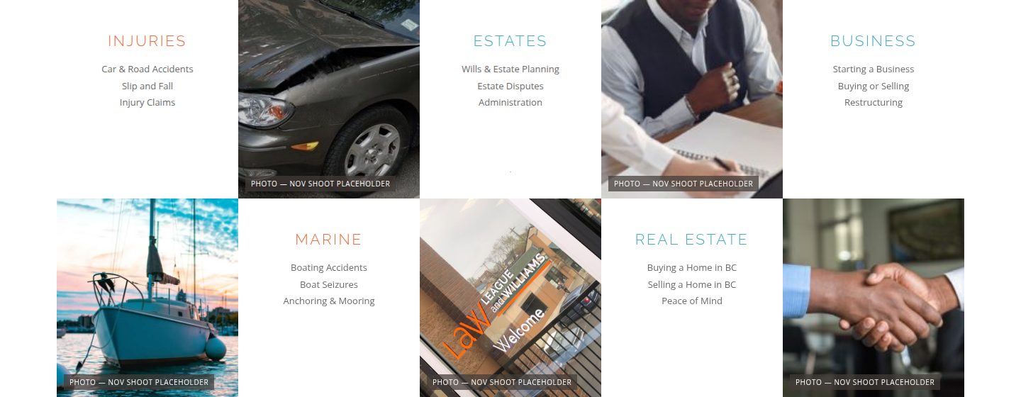 Resting — the checkerboard
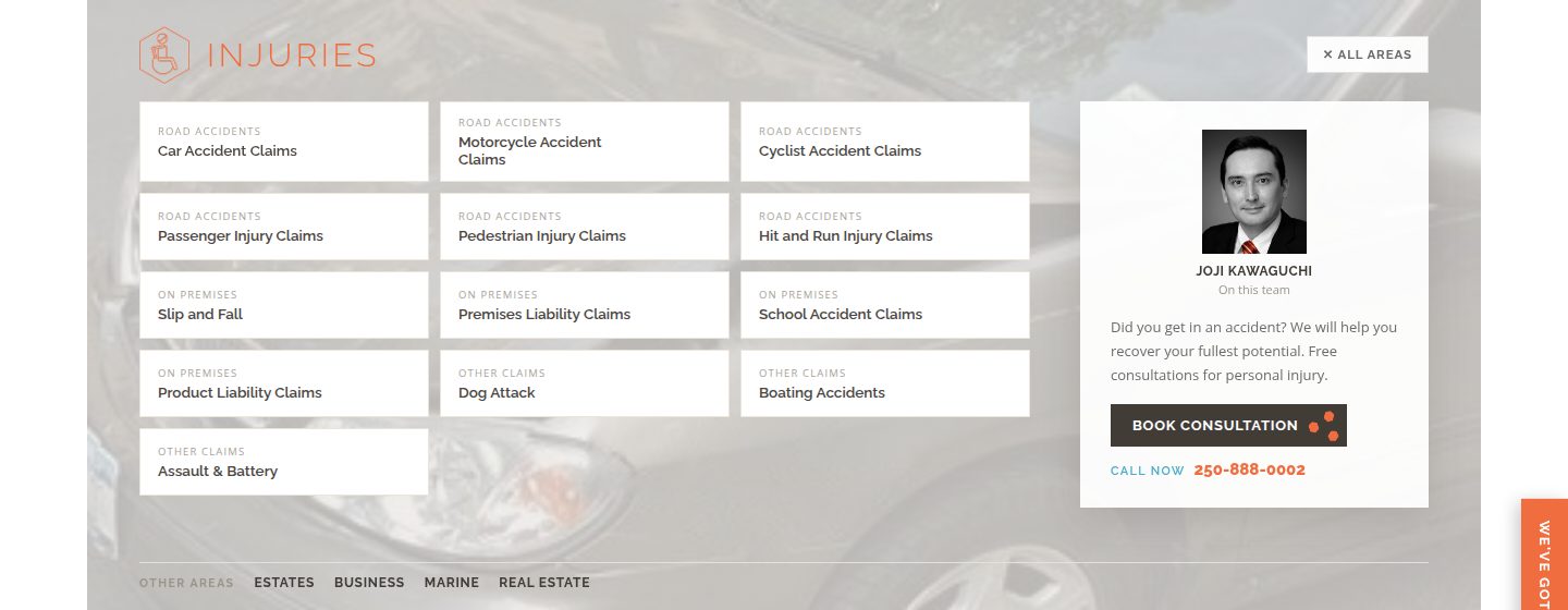 Active — Injuries takes over the grid
The contact band — the claim, and the second hit
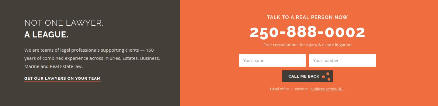
"Not one lawyer. A league." — the organising idea in six words, beside the phone number at giant size and a one-button call-back form. Contact has now hit twice inside a screen and a half. The band's split sits exactly on the checkerboard's own grid lines: one geometry, top to bottom.
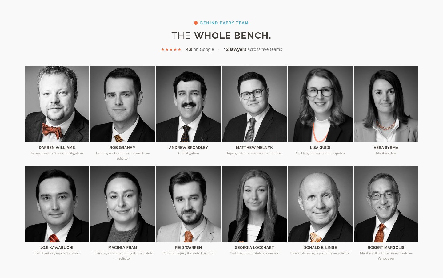
The bench — twelve lawyers, four pixels apart
Every lawyer, equal size, packed close — closeness as meaning: colleagues, not strangers. Nobody gets a bigger frame; each face links to its real profile. The kicker says "Behind every team" deliberately — a client works with a team, and the whole bench stands behind it. No overpromise.
Inside the league — photography below the fold
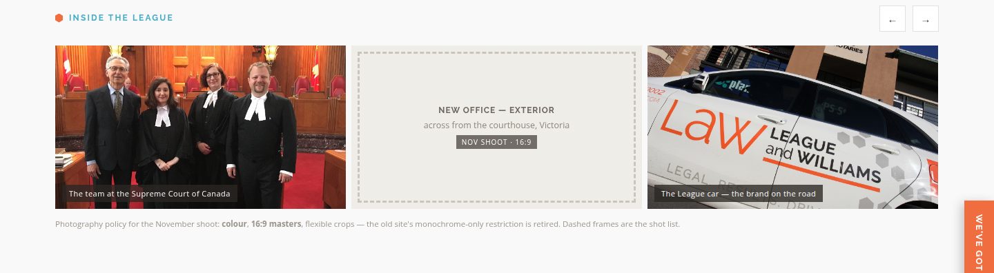
A 16:9 filmstrip of real colour photographs — the Supreme Court team, the branded car, the offices — with dashed frames that literally are the November shoot list. Photography lives below the triage screen, so the no-hero rule holds; the policy is printed on the page: colour, 16:9 masters, flexible crops.
Did you know — credibility that whispers
The firm's own LaW Facts, verbatim — the unanimous Supreme Court win, seven years of "Victoria's best law firm", the largest marine practice on the Island — one at a time between two hairlines. Proof, at conversation volume.

Locations — the full answer to "which number?"
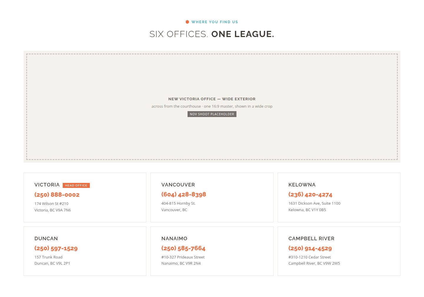
Six offices, six real phone numbers, every one tap-to-call, Victoria flagged as head office. On a six-office firm "call us" is ambiguous — this section removes the ambiguity completely.
Articles & questions — for the readers
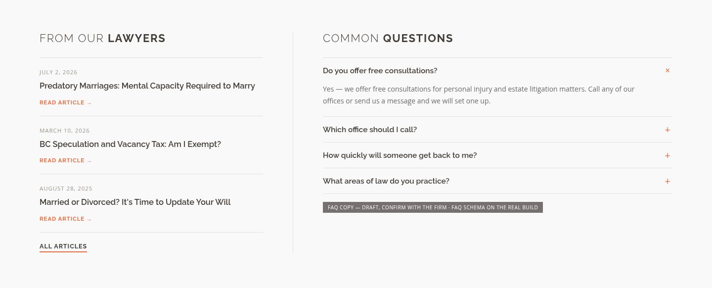
The three latest real articles beside a compact FAQ, sharing the same grid split as the contact band. Most visitors act on emotion and click; the minority who read get their material here — and the FAQ ships with schema markup on the real build.
Footer — one loud goodbye, then the map
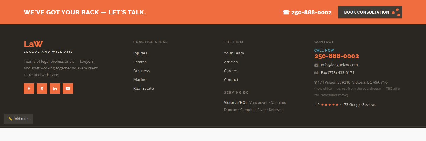
An orange CTA band ("We've got your back — let's talk") with phone and Book Consultation, then four working columns: brand, practice areas, the firm, full contact. Warm near-black, never pure black. The page opens on contact and closes on contact.
Always present — the consultation tab & modal
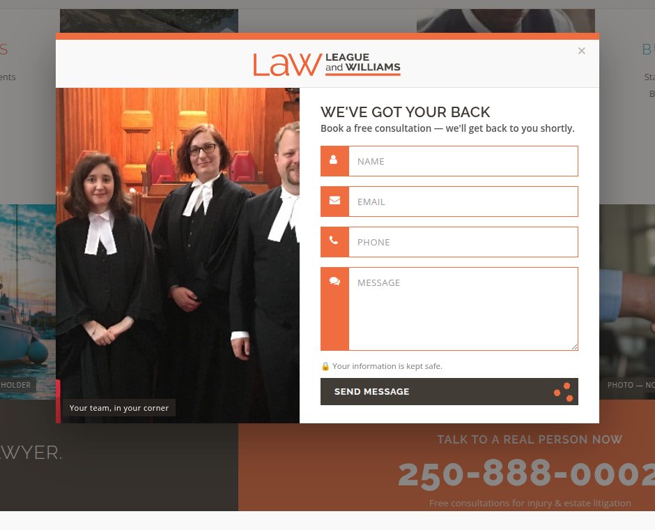
An orange tab waits on the screen edge on every scroll. It — and every Book Consultation button, and the ✉ on every single service — opens the same form, but the modal arrives dressed for wherever you came from: a motorcycle for motorcycle claims, the sea for marine, the team for everything else. One form, many doors, each already speaking the visitor's situation.
Try it from the hero grid: open either version → click Injuries in the checkerboard → hover a service box (e.g. Motorcycle Accident Claims) → click its ✉ — the modal opens with that service's own image. Compare with the orange side tab, which opens the neutral team version.