
Gold, as drawn. Matches the header exactly. The strongest ask and the one that repeats a colour already spent 200px above.
The site’s existing image device, unchanged: a 3/4 plate with the cream offset shadow, grain and greyscale. The head becomes a two column row.
It is the same composition the page then repeats six times further down. An inner page that opens with the device its sections use has nothing left to introduce them with.
A portrait crop, one or two subjects. A group shot cannot be cut to 3/4 without losing half the group.
Home/About Us
We make it possible for all business leaders to have strategic legal services on their team by removing the barriers of costs, response time, and complexity.
What we believe
We believe in the power of law to enable the freedom and confidence to go boldly into the unknown.
Takes the logo’s three concentric rings and draws them at page scale, with the photograph inside the inner ring. Rings are CSS, not an asset, so they scale and carry no white box.
The strongest brand signal of the five and the least forgiving crop. A circle throws away the corners of every frame, so each page needs a photograph composed for it rather than cropped into it.
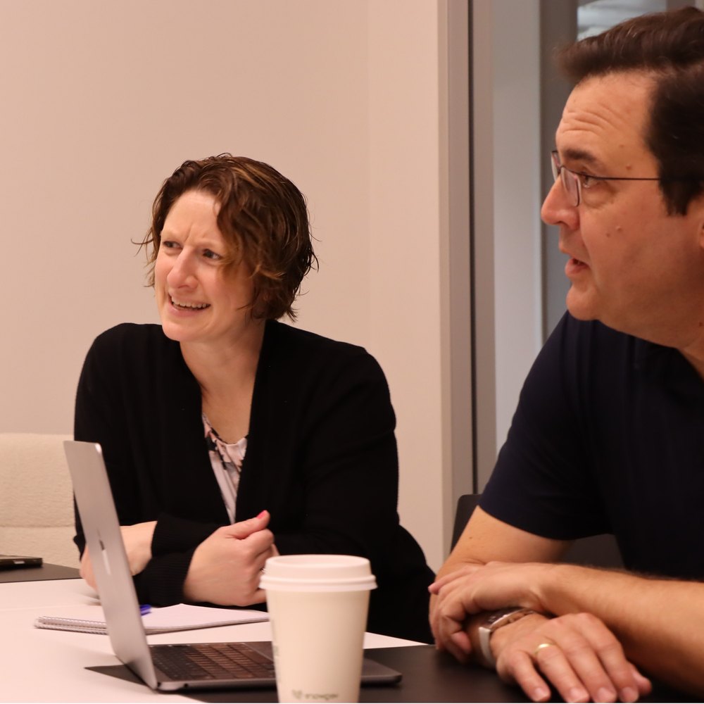
A single centred subject. The meeting frame below is already fighting it: the second face sits at the edge and the circle clips it.
Home/About Us
We make it possible for all business leaders to have strategic legal services on their team by removing the barriers of costs, response time, and complexity.

What we believe
We believe in the power of law to enable the freedom and confidence to go boldly into the unknown.
The plate drops 160px past the end of the gradient into the first section, so the head and the page read as one object rather than a banner sitting on top of a page.
It couples two sections permanently. The section below has to hold its text off the right column for the depth of the drop, on every page, or the first paragraph runs under the picture.
Same as option 1, a portrait crop, but with more headroom: the bottom third of the frame lands on white, so anything important has to sit in the top two thirds.
Home/About Us
We make it possible for all business leaders to have strategic legal services on their team by removing the barriers of costs, response time, and complexity.
What we believe
We believe in the power of law to enable the freedom and confidence to go boldly into the unknown.
The image runs off the right edge of the screen at full head height. No box, no radius, no offset shadow: a bled band is not a bounded object, and the page’s own radius rule bars a rounded full bleed.
It is the only option that cannot be centred in the 1440 wrap, so it needs a full width row with the copy padded to the wrap’s inner edge. Kadence does this natively. Nothing downstream is affected.
Any wide frame, cropped by the viewport rather than by us. It is the most forgiving of the five: the right hand side of the photograph is allowed to leave the screen.
Home/About Us
We make it possible for all business leaders to have strategic legal services on their team by removing the barriers of costs, response time, and complexity.

What we believe
We believe in the power of law to enable the freedom and confidence to go boldly into the unknown.
The copy keeps the full measure and the exact hierarchy already approved on the services page. The image is a letterbox strip beneath it, flush to the boundary, acting as the floor of the head.
The least ambitious of the five. It adds a picture without changing a single decision already made, which is either its virtue or the reason to reject it.
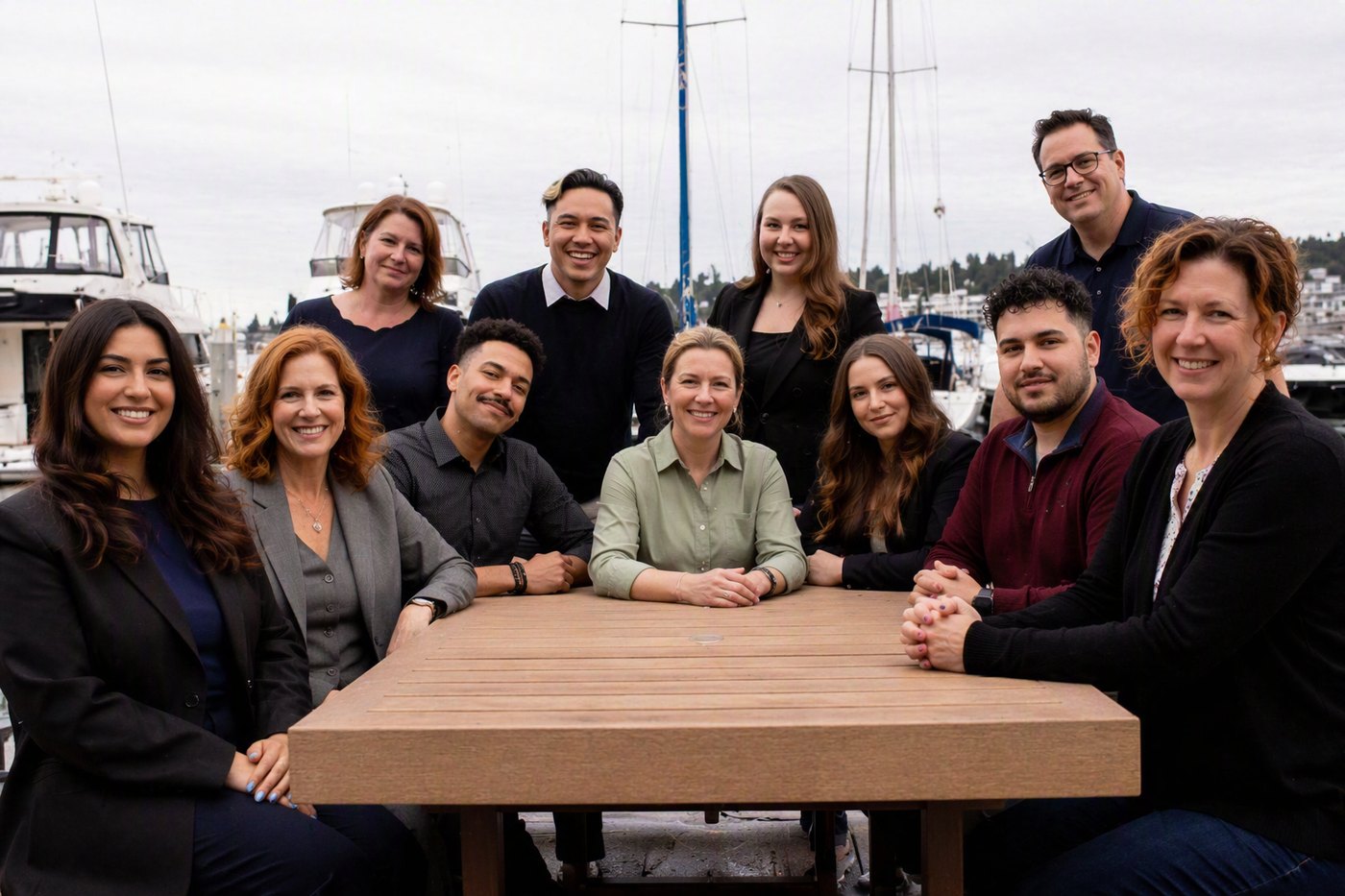
A 6:1 letterbox, which is the easiest crop to source or generate for ten pages and the one most photographs can give up. The team shot fits with room to spare.
Home/About Us
We make it possible for all business leaders to have strategic legal services on their team by removing the barriers of costs, response time, and complexity.

What we believe
We believe in the power of law to enable the freedom and confidence to go boldly into the unknown.
The aggression note has two halves: the button is gold twice, and it sits close to the header. The five options above answer the second half by putting an image between them. This answers the first, and it is worth deciding on its own, because whichever layout wins will use whichever weight wins. All three below are content width.
Gold, as drawn. Matches the header exactly. The strongest ask and the one that repeats a colour already spent 200px above.
NIGHT outline. Same action, second voice. Gold stays the header’s alone, so the page asks once at full volume and once quietly.
Text link, gold rule. Lightest. The head stops asking and starts pointing, which suits pages that are not themselves a pitch.