nowThe house treatment, unchanged
Grayscale, as the hero carries it now. Everything below is measured against this. The bar is not “does it look good” but “does it earn the extra step”, because every treatment here is one more thing that has to be reapplied to every future photograph.
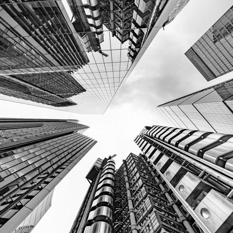
1Grain, subtle
Monochrome noise generated in the page (an SVG turbulence filter, no image file) laid over the photograph at 11% on multiply. It takes the digital cleanness off without changing the picture, and it gives large flat areas like the sky something to hold.
This is the one I would ship. It reads as printed rather than rendered, which suits a firm that has been in practice two decades, and it costs the page nothing: no asset, no extra request.
This is the one I would ship. It reads as printed rather than rendered, which suits a firm that has been in practice two decades, and it costs the page nothing: no asset, no extra request.
2Grain, heavier
The same filter at 22% with a coarser frequency, to show where the range runs out. At this weight the grain stops being a surface and becomes a subject: the eye reads texture before it reads the building. Useful as the outer marker, not as a candidate.
3Split tone
Cool NIGHT in the shadows, warm LAW cream in the highlights, midtones left neutral. That last part is what separates it from the duotone tested earlier: a duotone maps the whole range onto two colours and the picture becomes a wash, where a split tone keeps the middle grey and stays photographic.
It also does something useful on this page specifically: the warm highlights pick up the cream offset block behind the image, so the two stop arguing.
It also does something useful on this page specifically: the warm highlights pick up the cream offset block behind the image, so the two stop arguing.
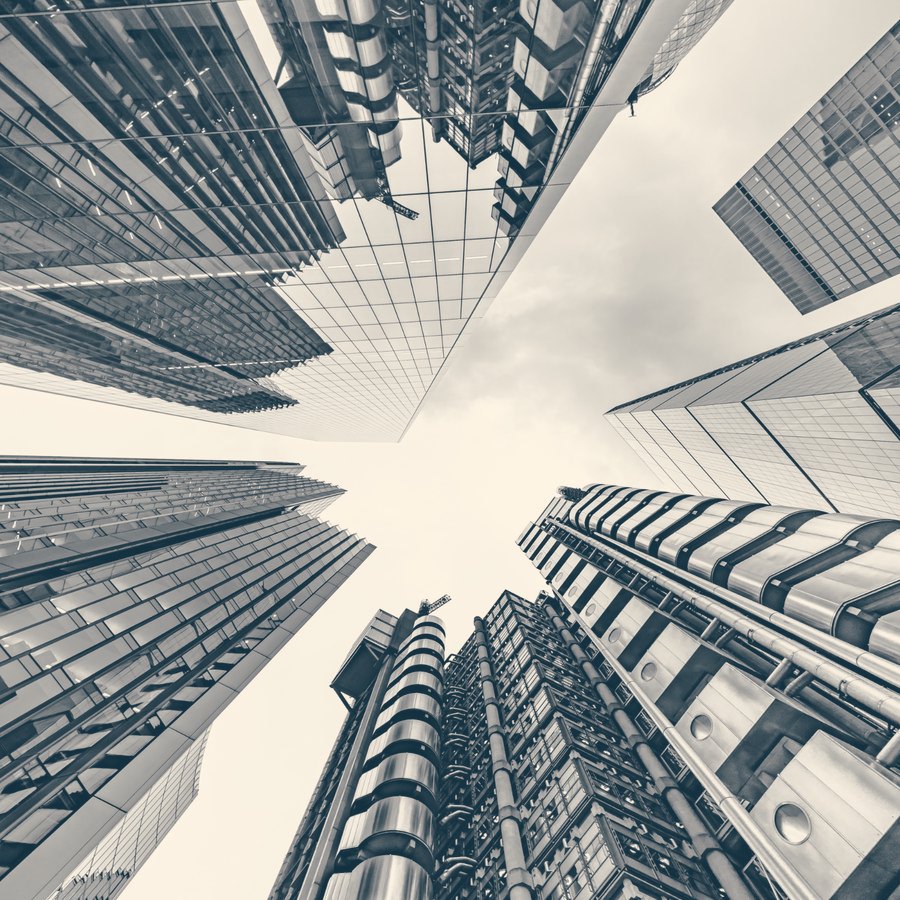
4Split tone with grain
The two combined, which is how film actually looks: tone in the shadows and highlights, grain throughout. The richest option here and the closest to a considered photographic treatment rather than a filter.
The risk is compounding. Two effects means two things to get wrong on the next photograph, and a treatment nobody can reproduce is a treatment that decays.
The risk is compounding. Two effects means two things to get wrong on the next photograph, and a treatment nobody can reproduce is a treatment that decays.
5Lifted contrast
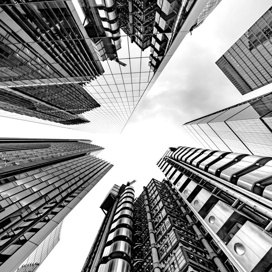
No effect at all, just a real black point and a little more separation. Included because it is easy to reach for a filter when the actual problem is that the photograph is flat. Compare it against the baseline before considering anything else on this sheet.
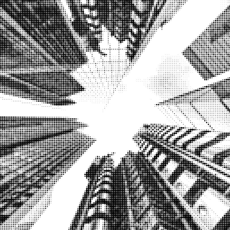
6Halftone
A true halftone: the dot area varies with local luminance, rendered at 3x and downsampled so the dots have clean edges. A CSS dot pattern cannot do this, because its dots are all the same size; it can only lay a screen over a picture rather than build the picture out of dots.
It ties to the dotted rules now used in the services list and it is unmistakably a deliberate choice. It is also a strong stylistic statement for a law firm, and it needs the source image to be high-contrast to survive: this one does, most portraits would not.
It ties to the dotted rules now used in the services list and it is unmistakably a deliberate choice. It is also a strong stylistic statement for a law firm, and it needs the source image to be high-contrast to survive: this one does, most portraits would not.
7Vignette
A soft darkening at the edges, drawn with a radial gradient over the photograph. It focuses the centre and helps the image sit inside its box.
Included so it can be ruled out. A vignette is the most dated effect on this sheet, and the client’s complaint about the current site was that it looks dated. It also fights the offset shadow device, which already gives the image an edge.
Included so it can be ruled out. A vignette is the most dated effect on this sheet, and the client’s complaint about the current site was that it looks dated. It also fights the offset shadow device, which already gives the image an edge.